[ad_1]
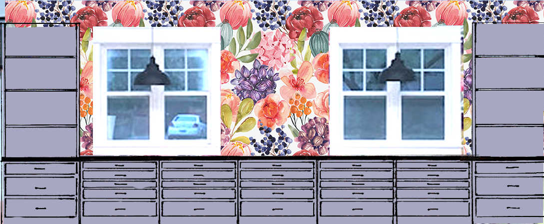
On Friday, I used my photo editing software to pull out 18 different colors directly from the studio wallpaper to see what they might look like as a cabinet paint color. I’ve done this exercise before, but (1) that was way back in 2019, and I’ve changed my mind approximately 273 times between then and now, (2) that was with the original wallpaper with the bolder colors and now I have a new edited wallpaper design, and (3) that was before I made a cabinet decision, but now the cabinets are actually ordered and on their way.
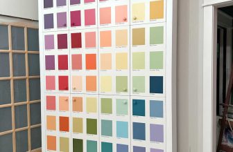
So I’m starting the process over again, and I isolated 18 potential cabinet colors from the new wallpaper. I thought it would be a fun exercise to post them on my Facebook page to see what people thought, and people definitely had some opinions! 😀 This morning, the post had almost 600 comments, and most people offered not just one suggestion, but multiple suggestions. Here are the 18 different colors.
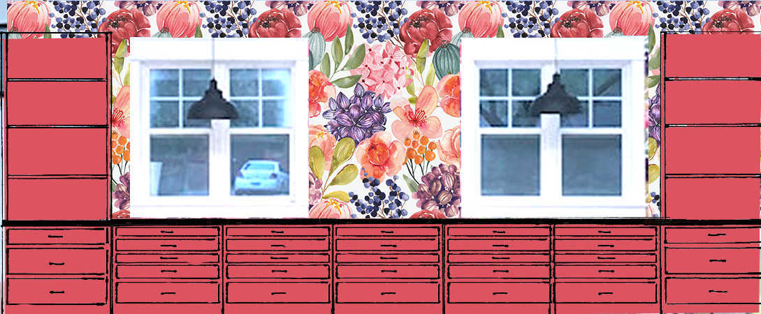
From those pictures alone, my favorites were #3 (coral), #8 (light orange), #11 (green), and #17 (dark purple).
I actually totaled up the votes from the comments, and the clear winner was #14 (medium teal) with 115 votes. The next ones, in order, were #4 (pink) with 88 votes, #12 (light green) with 87 votes, #5 (light pink/blush) with 72 votes, and #17 (dark purple/eggplant) with 70 votes. Those were the top five.
The least favorites were #10 (dark green) with 15 votes (navy blue), #2 (pinkish red) with 17 votes, #16 (midnight blue) with 17 votes, #1 (red) with 20 votes, and #13 (dark teal) with 25 votes.
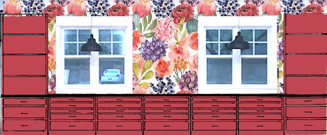
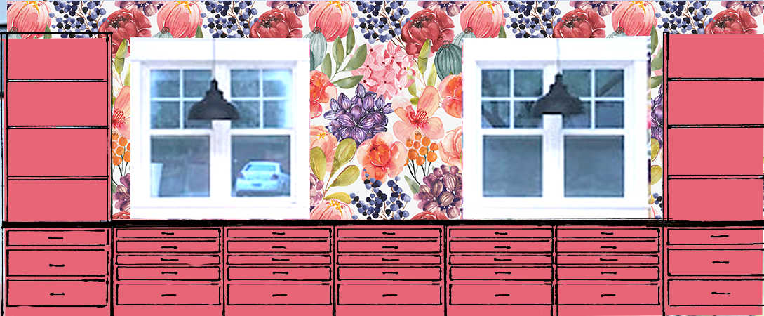
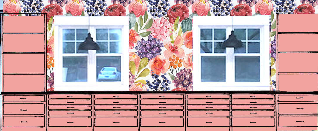
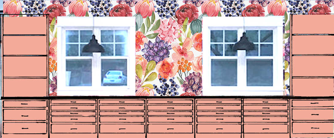
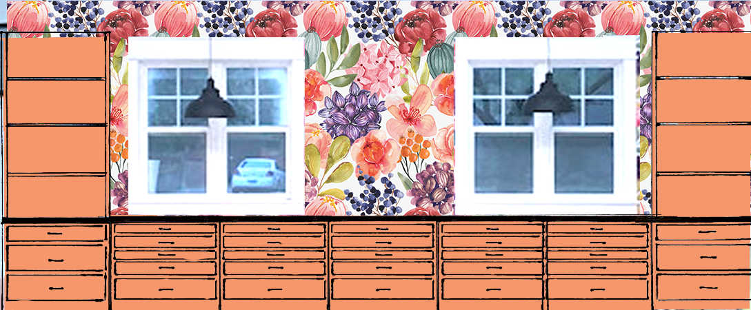
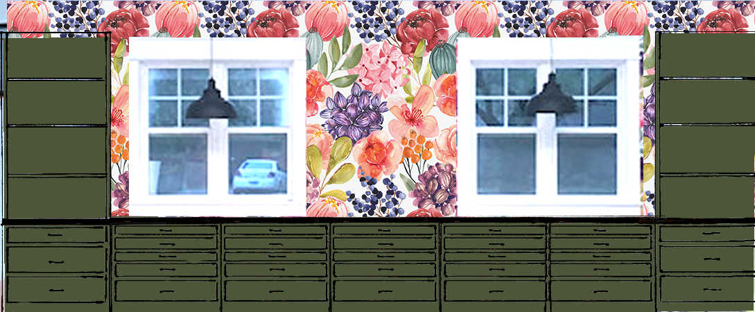
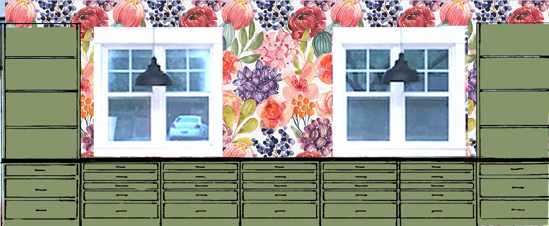
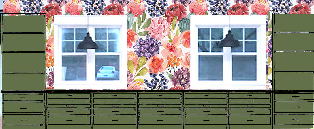
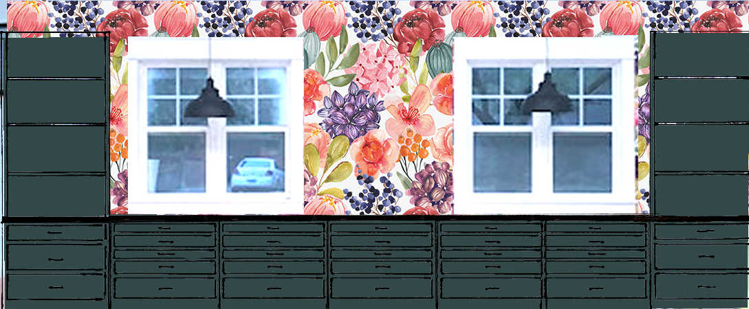
Then my mom decided to do mock ups of all eighteen colors to help me narrow down the options. Not only did this help me rule out some colors immediately, but I was a bit shocked to see that some of the colors I really liked in the samples above actually looked pretty awful in the mock up. Here’s what those looked like…
The original 18 options, in order:


What do you think? Did those mock ups change your mind? Did you see a color that you really liked with just the swatches, but didn’t like at all on the mock up?
That happened to me! With just the swatches, I loved the orange (#7) and the medium green (#11). I think both of those look pretty awful in the mock ups. Those were very easy to rule out, as were several others.
My Favorites Based On The Mock Ups
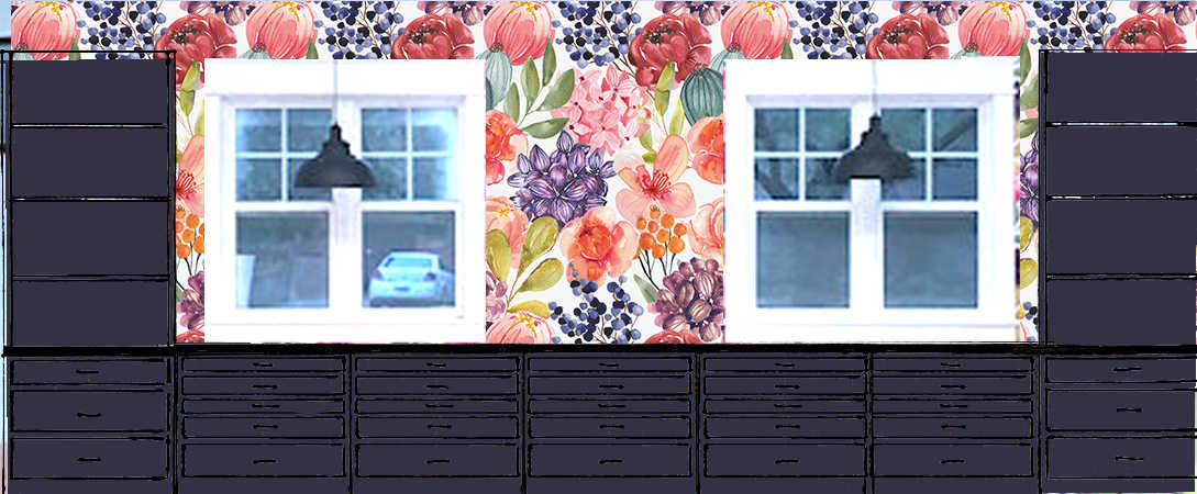
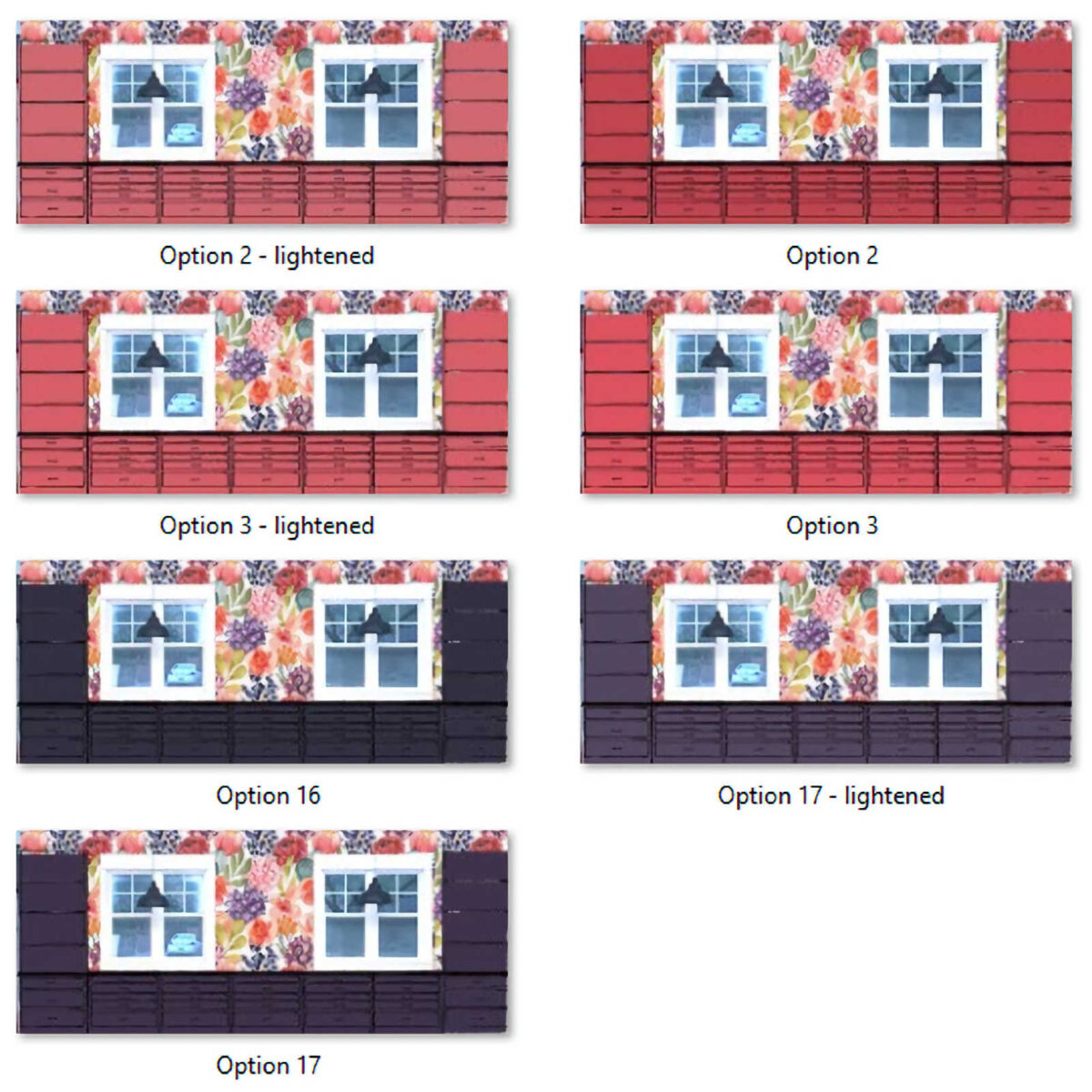
After looking at those, my favorites (two of which were least favorites on Facebook 😀 ) switched to #2, #3, #16, and #17, which are in order below:


Three Additional Options Added
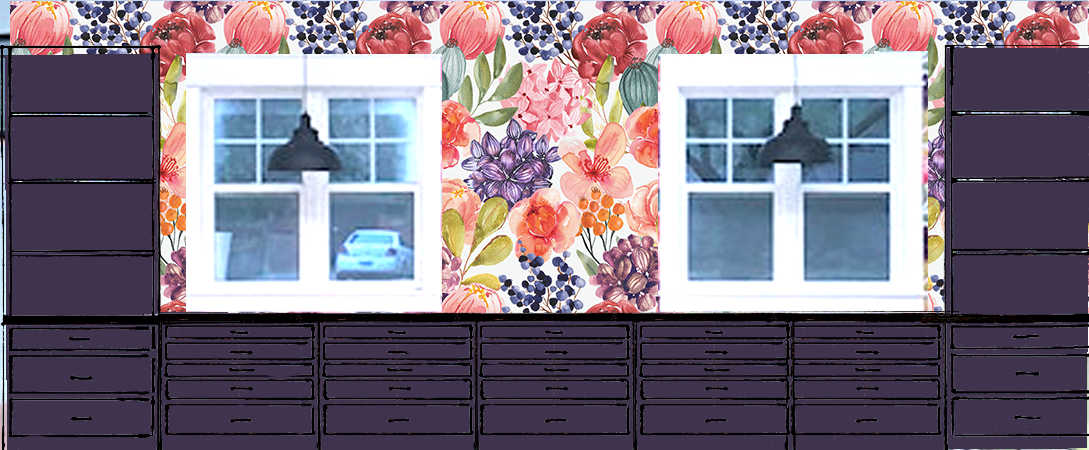
Three more options were added to the finalists when my mom lightened #2 and #17, and I lightened #3. Here are those new options:


All Seven Finalists
So, after aalllllllll of that, it boils down to this. My mom’s favorite is Option #2 lightened, and my two favorites that I can’t seem to decide between are Option #3 lightened, and Option #17 lightened. But here’s a glimpse of all seven of my final favorites:
I have a feeling that the final color won’t be any of these exact colors. The chance of me selecting a paint color from this post, having it color matched in actual paint, and thinking it’s perfect right out of the can, actually in the room, with the actual wallpaper, is approximately 0.0012793%. I’m sure it’ll need some tweaks. But this at least helps me to rule out certain colors (orange, green, and teal are a no go for me, as are any light colors like blush or lavender). And it helps me to narrow down the specific characteristics of the colors I like. For example, I may like a slighter lighter, grayer purple over a deep, super dark purple. And I like a lightened pink with a touch more vibrancy to it than what my mom likes. And navy blue is always a good idea. 😀
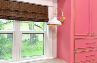
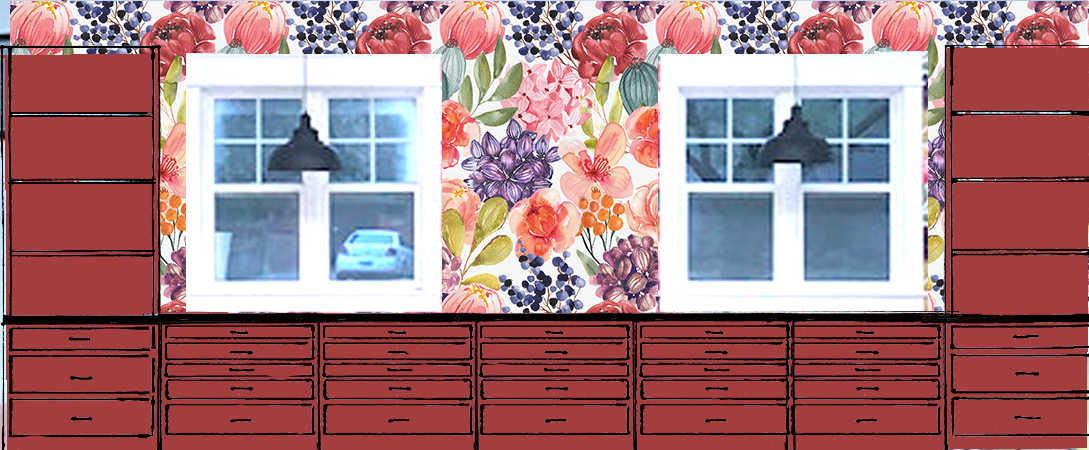
Now I want to hear what you have to say. Just keep in mind that (1) the wallpaper will only go on the long main wall, and the print will be larger than what is is now, (2) I’m planning on the walls and ceiling being white, unless a better option presents itself, and (3) the floor will be a geometric white and very light gray pattern.
So, what say you?
EDIT: Y’all, I cannot stress this enough. White is NOT an option. It’s just not. If you love white cabinets, go crazy with white cabinets in your own home. I don’t like white cabinets, and I don’t want them in my studio. 🙂 There is a 100% chance that my cabinets will be painted a color that isn’t white.

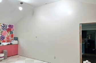
Addicted 2 Decorating is where I share my DIY and decorating journey as I remodel and decorate the 1948 fixer upper that my husband, Matt, and I bought in 2013. Matt has M.S. and is unable to do physical work, so I do the majority of the work on the house by myself. You can learn more about me here.
I hope you’ll join me on my DIY and decorating journey! If you want to follow my projects and progress, you can subscribe below and have each new post delivered to your email inbox. That way you’ll never miss a thing!
[ad_2]
Source link